To Stay,
To Live, To Be
LOCKE APARTHOTELS

Not a serviced apartment. Not another nice hotel. Not like anywhere you’ve booked before. Designing a new way to stay by shaping a brand and experience that filled a Locke- shaped hole in an industry lacking soul.
Brand Positioning & Strategy
Brand Narrative & Naming Architecture
Brand Identity & Tone of Voice
Brand Communications & Marketing
Brand Experience & Hallmarks

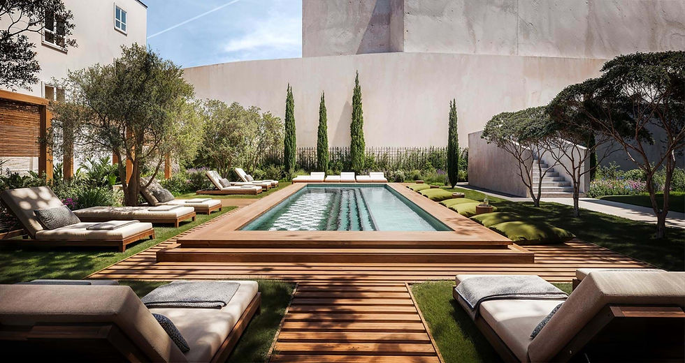
Locke calls itself an Aparthotel – rooms with space to eat, sleep and unwind. With all the stuff you actually need, and none of the mints-on-pillows you don’t. With three properties open in the UK, they approached us with big plans to grow across Europe. Working with the team, we helped shape the brand proposition, visual and verbal identity, and guest experience.
Immersing ourselves in the world of Locke and their guests, the overriding sense of space, autonomy, and community made this more than just a place to stay. Made to be lived in, not just slept in – Locke is a place where you can continue your everyday, even when you’re away from home.
The unique sense of autonomy and freedom found at the heart of the brand inspired a design style that is bold, optimistic and free. A dynamic kit of parts allows the brand to remain fresh across global channels, whilst carrying a sense of adaptability at a local property level. A refreshing tone of voice steers clear of hotel clichés and industry blah, creating a voice that is upfront, down-to-earth and to-the-point.
A new way to stay.

Feel Free.
Book for a night or a year. Cook at home or venture out. Wake up with yoga or a Bloody Mary. We’ve thrown out the rule book – the one that says hotels have to do things in a certain way, at certain times and with a certain style. Stay with us and you stay on your terms, whatever they may be. And stay yourself, not just another guest in another hotel.
Collaborating with acclaimed hand lettering artist, Alison Carmichael, we refreshed the global Locke mark to bring a renewed sense of flow, freedom and humanity to the name. Used across digital channels, this has become the ‘global’ signature for the brand.
From streets to neighbourhoods to iconic personalities, each property name is inspired by a local story. Word play sets the direction for each individual property logo, bringing further narrative and adaptability to how the brand comes to life.
We designed this locally led philosophy to flow across all aspects of the design language and touch-points throughout the guest journey.
Locally led.


Room keys unlock more than just a space to sleep. Each Locke is unique in its own special way. But whether in London or Edinburgh, Manchester, Dublin or beyond, you’ll recognise a certain Locke take on things to ensure each stay is like no other. We helped shape the brand experience and articulate the brand hallmarks that run through each property – across the spaces, service style and experiential programming.
From an ‘aparthotel’ in three locations to sixteen unique properties across Europe, and a growing number in the pipeline – we helped Locke create a distinctive brand identity and framework designed to adapt across channels and properties. Supporting the brand to grow at pace without losing the integrity of its original ‘one-of-a-kind’ vision.
More than a place to sleep.

Touchpoints


From an ‘aparthotel’ in three locations to eighteen unique properties across Europe – the unified identity and framework helped grow the brand at pace and across channels without losing the integrity of its original vision.
GUEST BOOK

"The four-year-old Locke brand is yet more proof, if you still need convincing, that the classic model of the hotel is on its last legs."
– Wallpaper*

Wellness, Redefined.
Raising the bar of wellness hospitality in the Middle East with a more holistic and elevated design concept in-tune with people and place.
Even Hotels
The Convent Is Calling.
Part hotel. Part retreat. Part playground. Positioning Locke at the heart of Lisbon with bold and beautiful communication that celebrate Lisbon life.
Locke De Santa Joana

Left bank Living.
Call it an aparthotel. Call it a pied-à-terre. Call it home. In a district known for its independent spirit, Locke does city-stays differently.
Le Jardin de Verre by Locke

Incredible Occasions.
What makes an occasion one that stays with you for a lifetime? Transforming celebrations from ordinary to extraordinary.
InterContinental Hotels

Easy-going Stays.
Inspiring growth with a flexible design approach that celebrates the unique character of each property and location.
Garner Hotels

With Love, For Life.
From first brick to the last – effortlessly liveable homes, designed and built around the rituals of everyday life, with love and enduring character.
Vabel London